
Membership Experience
Rebrand and unified reservation system for a global members-only network.
- Client
- Confidential — Global Members-Only Recreation Network
- Category
- Membership Experience · UX Strategy · Design System
- Year
- 2026
The problem
A rapidly expanding membership network had outgrown its digital experience. The reservation flow was fragmented, tier benefits were hidden behind nested menus, onboarding was inconsistent, and franchise locations were telling different digital stories. On-site staff used disconnected tools that did not share a single view of the day. Without a research-driven product lifecycle, the team was optimizing against assumptions rather than member behavior. The business risk was operational at scale: a single membership promise delivered inconsistently across a growing location network.
My role
UX Strategy & Design Lead — Member Lifecycle, Rebrand, Admin Surfaces
- Led UX strategy across the full member lifecycle — awareness, conversion, onboarding, first reservation, and retention — across iOS, Android, tablet, responsive web, and on-site admin console.
- Ran the complete UX audit of existing member and admin flows and restructured the product around membership tiers, add-ons, and upgrade incentives.
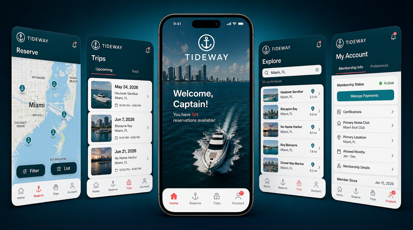
- Designed a single reservation graph that powers three purpose-built surfaces: pocket-sized mobile, planning-forward web/tablet, and operationally dense admin console.
- Built a white-label enterprise design system with brand tokens and shared components so franchise operators stay on-brand while retaining local flexibility.
- Partnered with product, engineering, marketing, operations, and franchise field staff from discovery through phased rollout.
- Established a continuous research practice spanning discovery interviews, usability testing, surveys, and analytics to inform decisions at every stage of the product lifecycle.
- Synthesized behavioral analytics, survey data, and qualitative feedback into A/B test hypotheses and roadmap priorities, then measured impact after release.
Process
- Step 01
Discovery & Foundational Research
Conducted stakeholder interviews, member interviews, and franchise field visits to map the end-to-end member and staff journey. Ran surveys to baseline satisfaction, NPS, and top pain points, and reviewed analytics to identify drop-off points, repeat failures, and high-friction flows.
- Step 02
Concept Validation & Usability Testing
Tested early concepts and prototypes with members and staff through moderated and unmoderated usability sessions. Used task-based scenarios, SUS, and first-click analysis to validate information architecture, navigation, and the three-tap reservation target before any code was written.
- Step 03
Lifecycle Audit & Design System
Mapped the full member arc from first search to repeat use, identifying where drop-off, confusion, and staff intervention were most costly. Built a token-based design system that scales across mobile, web, tablet, admin, and future markets.
- Step 04
Rebrand & One Reservation Graph
Restructured the product around tier value and aligned member booking and staff operations on the same reservation model, so every surface reflects one source of truth.
- Step 05
Launch, A/B Testing & Iteration
Released a phased rollout with analytics instrumentation and in-app feedback loops. Ran A/B tests on onboarding, reservation entry points, and upgrade prompts. Iterated based on funnel data, support tickets, survey responses, and ongoing usability sessions.
In the wild


Measurable results
Scale is only useful when the local experience feels more personal, not more corporate. The strongest enterprise redesigns start by shadowing real work on the floor, then keep listening through surveys, analytics, and A/B tests long after launch.
Generalized for confidentiality
Client and industry details have been generalized. Screens, metrics, and workflows are described in generic terms; any numbers are directional planning estimates, not audited results.
A membership model built for access, not ownership
The program removes the ownership burden and replaces it with a shared, well-run fleet. The digital experience had to make that promise feel as effortless as the on-site one.
Hassle-free access
Maintenance, cleaning, insurance, and storage handled by the network.
Diverse fleet
A wide range of assets suited to every preference and location, surfaced by availability.
Unlimited training
Built-in onboarding so every member feels confident before their first session.
Global reciprocity
Reciprocal access across the network — one membership, many home markets.
Research, testing, and analytics at every stage
The redesign was not a one-time research sprint. We used qualitative and quantitative methods continuously to de-risk decisions, validate direction, and measure post-launch impact.
Discovery
Stakeholder interviews, member interviews, field visits, and surveys to baseline satisfaction, NPS, and top pain points.
Usability testing
Moderated and unmoderated prototype testing with task scenarios, SUS scoring, and first-click analysis to validate the reservation flow.
Analytics & A/B testing
Funnel analysis, drop-off tracking, and A/B tests on onboarding, entry points, and upgrade prompts to prioritize and confirm improvements.
Continuous listening
In-app feedback loops, support ticket review, and ongoing surveys to iterate after launch across the full member lifecycle.
One reservation graph, three ways in
The platform is built on a single reservation model, exposed through purpose-built surfaces for members and staff.
- Step 01
Three-tap booking
Members reach a confirmed reservation in three taps from home.
- Step 02
Live day view
The admin console is anchored by a real-time timeline of the day.
- Step 03
Cross-device parity
One reservation model renders per device — pocket-sized, calendar-forward, or operationally dense.
- Step 04
Location-aware availability
Reservations respect location-specific fleet availability and reciprocal access.
Award-winning membership app
The mobile app received the Marine Marketers of America 2026 Neptune Award for New Product Launch — recognizing the team's work in creating a best-in-class digital membership experience.